Failure
The design of these two posters is a visual representation of my experiences and feelings about failure with only the use of typography.
Client
Ideas and Images
Year
2023
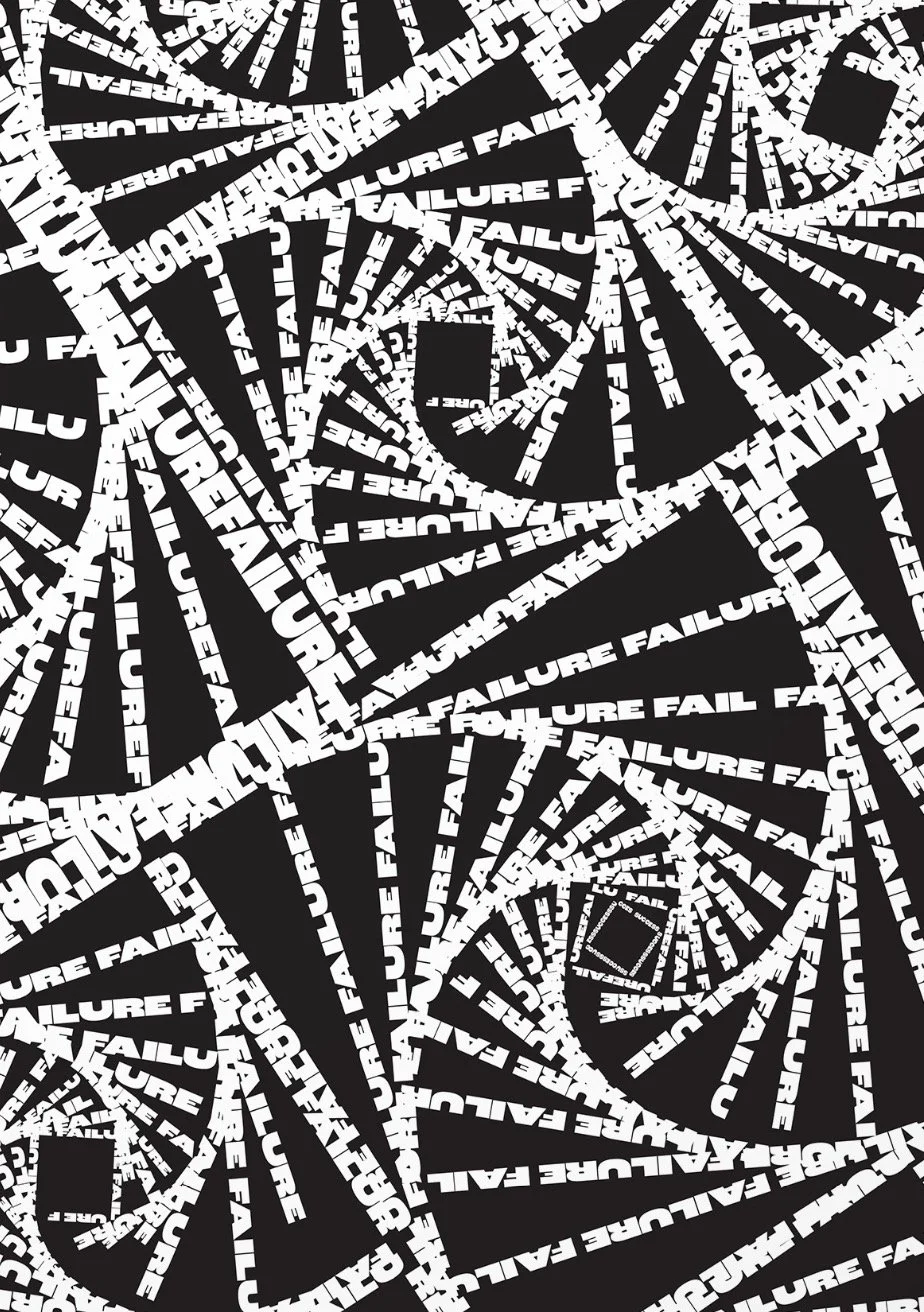
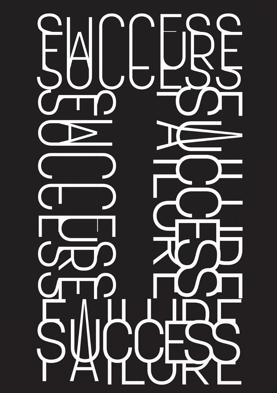
For this poster series, I chose to only do it in black and white because of the overwhelming visuals of the swirls. I chose to use a sans serif with all caps to help with the illusion of lines being composed with the word. It makes it easier to be drawn into the swirls as your eyes lead throughout the poster. For the second poster I had to pick a typeface so that when the two words were put together they could still be legible but still difficult to read if I chose a heavier font size, I don't. It would not have been feasible to create the intertwining letters.